PontaHR
All-in-one HR tool
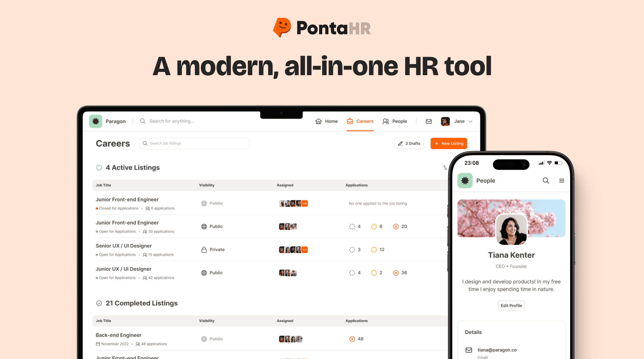
A platform for complete employee lifecycles. From hiring and onboarding, all the way to regular 1:1 meetings, feedback and reviews.
Project Overview
We began working on the PontaHR project in April 2021 with the aim of creating a modern HR tool catering to the needs of small to mid-sized businesses. PontaHR is envisioned as a comprehensive platform that guides organizations through the entire employee lifecycle, from recruitment and onboarding to regular one-on-one meetings, feedback sessions, and performance reviews.
At present, our focus has been on successfully implementing the Applicant Tracking System (ATS), which serves as a foundational element of the product. The project is an ongoing endeavor, and we're actively developing features to realize the complete vision for PontaHR as a single HR solution.
Problem
PontaHR emerged from a recognized gap in the market – there was no single tool catering to the complete spectrum of an employee's journey within a company. Small to medium-sized businesses lacked a unified platform that seamlessly handled everything from recruitment to retirement.
Also, the market lacked tools with good, easy-to-use designs. Many existing solutions were not only outdated, but also have cluttered and confusing interfaces. Recognizing that, my goal with PontaHR is not only to offer a unified solution, starting with the ATS module, but to redefine the user experience with a modern, intuitive design.
Beyond simplifying the hiring process, PontaHR aims to tackle crucial aspects such as employee availability, streamlined time-off requests, and centralizing vital company information within the Handbook. The vision for PontaHR is to be a one-stop shop for businesses, starting with the ATS.
Audience
In collaboration with our marketing team, we defined PontaHR's brand positioning, targeting small and medium-sized businesses with a friendly, honest, and transparent image. This influenced our design language, ensuring it strikes a balance between playfulness and professionalism to resonate with our audience and enhance the user experience. My design decisions were a thoughtful response to the specific characteristics and preferences of the businesses we aim to serve.

Getting started & building the brand
I joined the PontaHR project right from its very beginning as the lead designer. In those early stages, PontaHR was more of a concept than a concrete tool. Working alongside my product manager, who also brought a designer's perspective to the table, we collaboratively shaped the evolution of the tool.
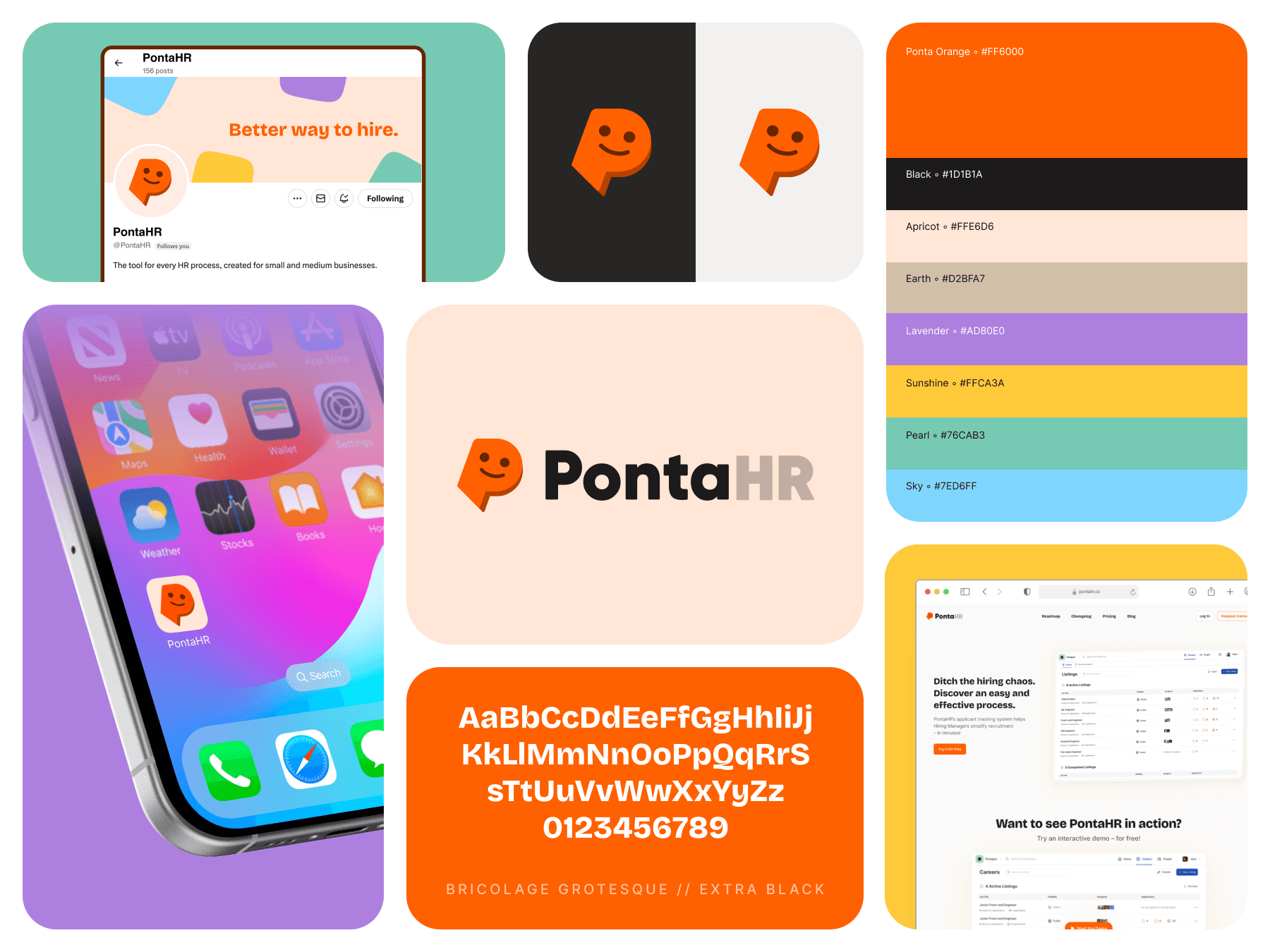
Being a part of the project from the ground up meant not just designing user interfaces, but also crafting an entire brand. This involved everything from selecting a name and designing the logo, to choosing the color palette and outlining our marketing strategies. It was a comprehensive startup experience that allowed me to grasp every facet of building a modern, thoughtful product.
It's worth noting that I designed the current logo of PontaHR, a visual representation of the brand.
Ideation, sketching & wireframes
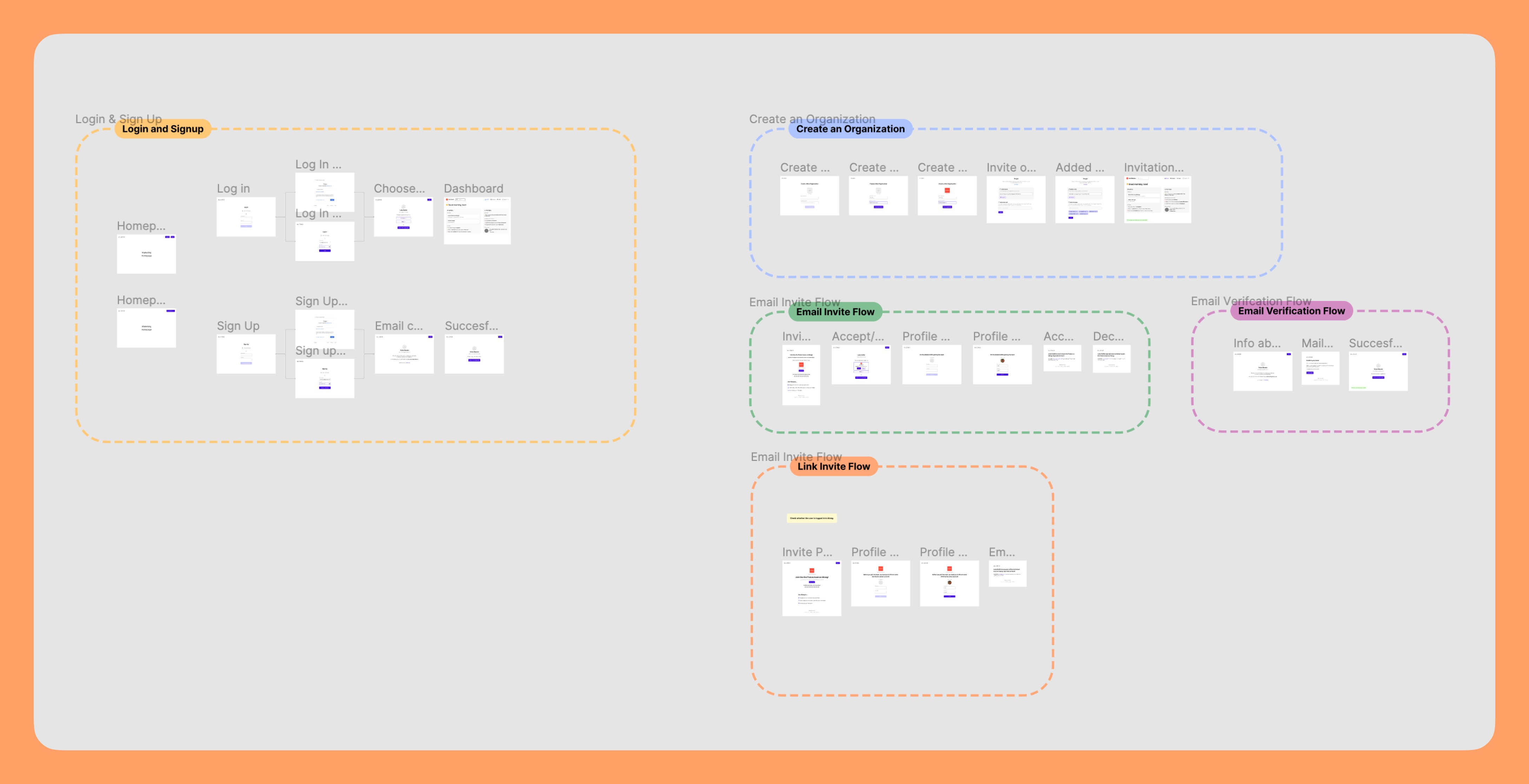
With a clear vision of PontaHR's objectives, I transitioned into the practical phase, starting with wireframes. Collaborating closely with my product manager, we prioritized building the Applicant Tracking System (ATS), recognizing its significance as the most extensive feature.
Since the idea for PontaHR was to be as customizable as possible, I made a bunch of different wireframes in Figma. Our goal was to offer users "Custom fields", allowing them to tailor job listings and candidate application forms to their preferences. This made the job much more complex since I navigated the challenge of designing an intuitive system for choosing and populating these fields.
In this phase, I also seized the opportunity to play around with setting up the design system and building all the components. Bear in mind, this was the period when design systems just became a new thing, and a design standard soon after. During this phase, I learned so much about design systems and built, what later became, the biggest and most complex design system in the agency I currently work at.
Building Design System
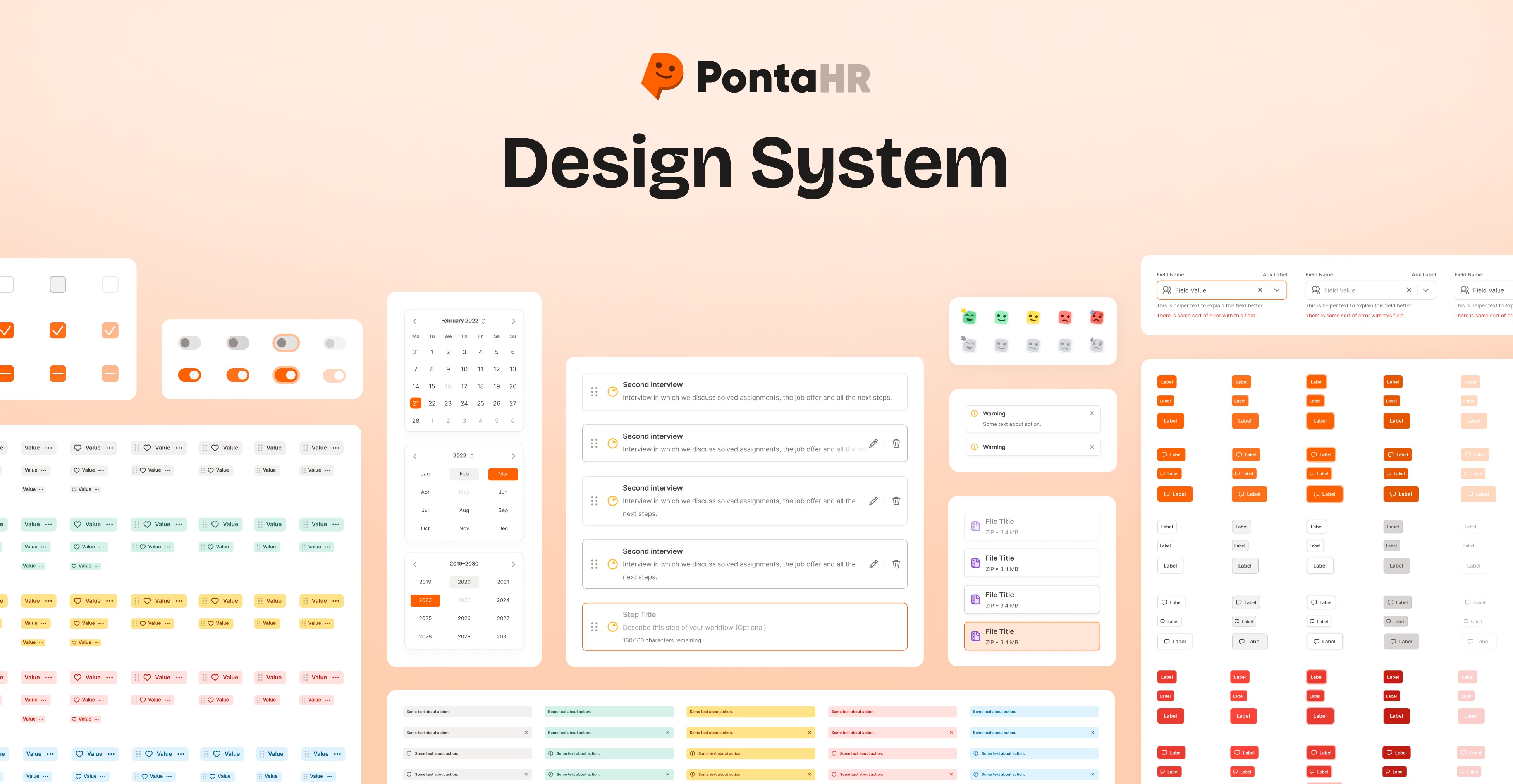
In the era of growing popularity of Design Systems, I foresaw their importance becoming a new standard. Recognizing the magnitude of PontaHR as a substantial project, adopting a design system was not just logical, but crucial. I initiated the setup, starting with foundational elements like colors, spacing, and typography. Progressing, I crafted essential components such as buttons, input fields, and alerts. The creation of over 150 icons to ensure a cohesive visual language is also noteworthy.
As PontaHR evolved into a sizable project, the complexity of components grew proportionally. This challenge boosted my enthusiasm. Each enhancement introduced by Figma for design systems was promptly incorporated, making the design system for PontaHR the biggest and most complex one ever constructed or utilized within the agency. This system quickly emerged as the gold standard, influencing the approach to future design systems for projects yet to come.
Challenges & solutions
Once I was happy with the initial wireframes, I held interviews with a few members of the HR department where I showed them high-fidelity wireframes and mockups. After I gathered all the feedback, I transitioned into the creation of the final designs.
Customizable job listings
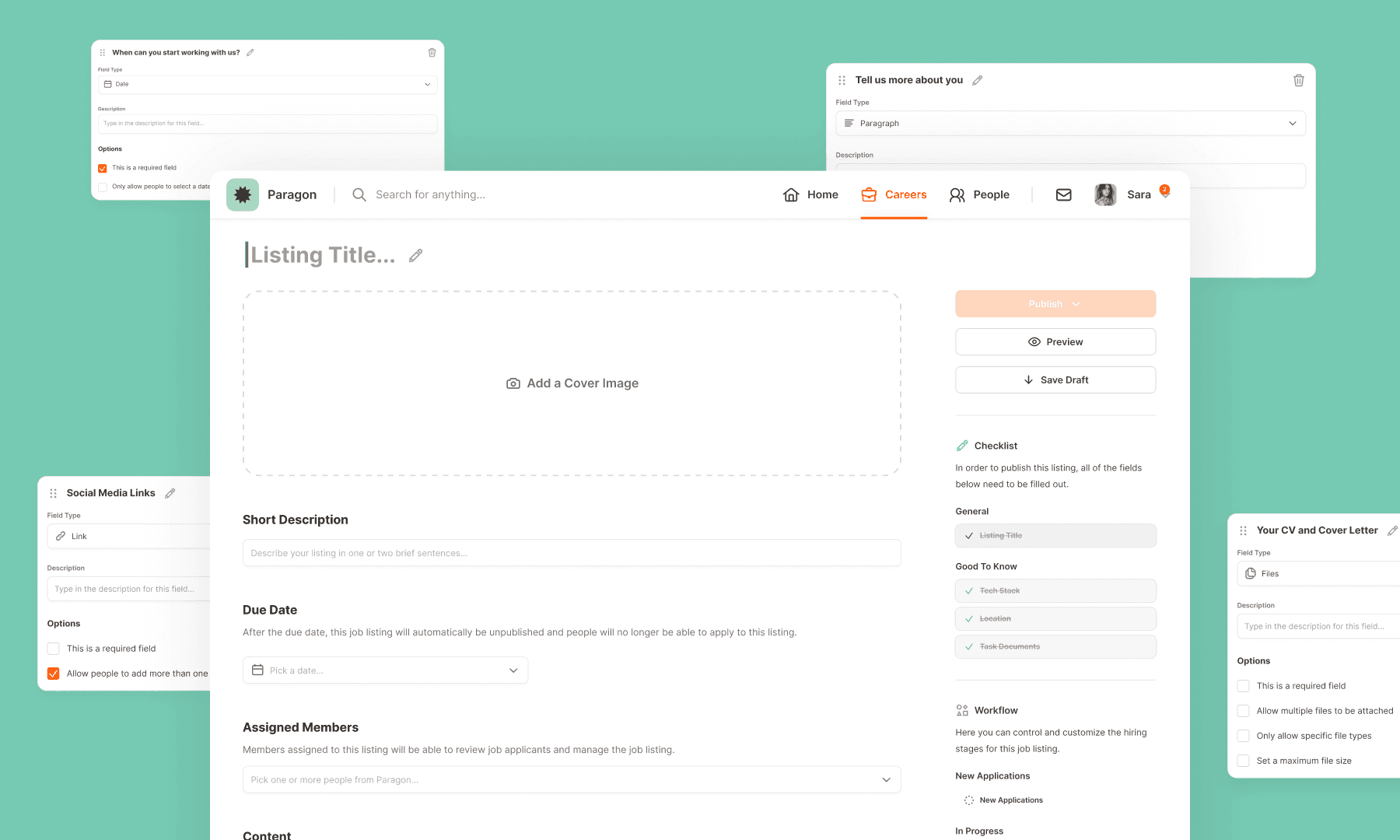
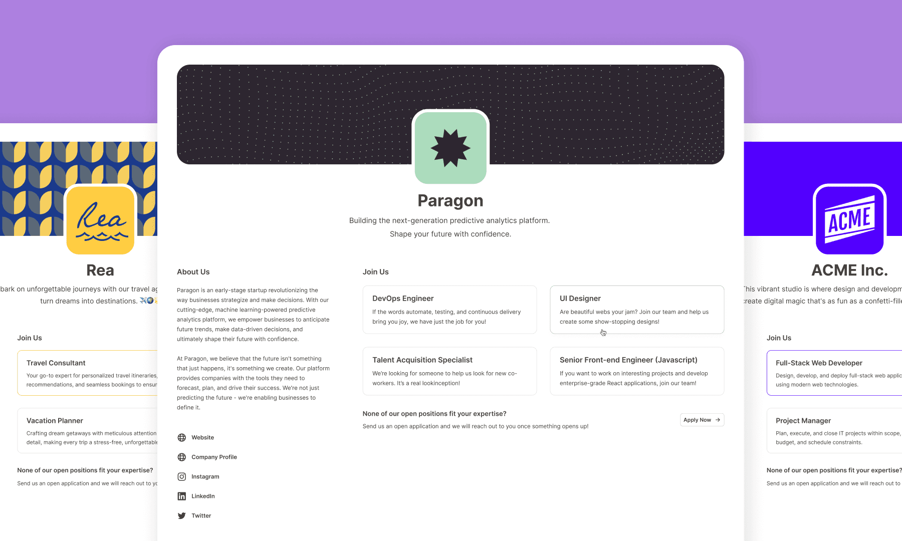
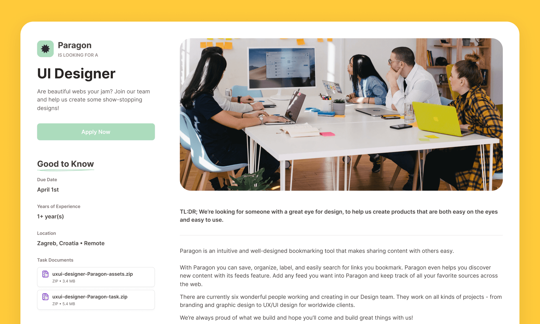
My initial focus was on crafting a seamless flow for creating a new job listing. The goal was to make this process as customizable as possible while presenting the final listing in an appealing style for potential candidates on the company's public page. The creation process includes standard elements, like selecting a cover photo, adding a brief description, and specifying hiring managers. However, the standout feature is the introduction of custom fields. Users have the flexibility to choose the type of field—whether it be a text paragraph, link, date, list, checkboxes, or other options. Further customization options include marking fields as required and streamlining the job listing creation process.
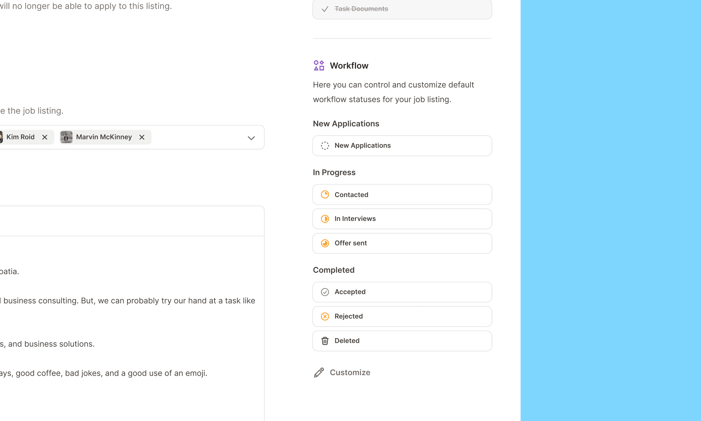
Beyond custom fields, users have control and can customize workflow stages for each job listing, dialing in the perfect hiring process tailored to their needs. This approach empowers users to make each job listing unique and specifically tailored to its requirements.
Manage listings & candidates easily
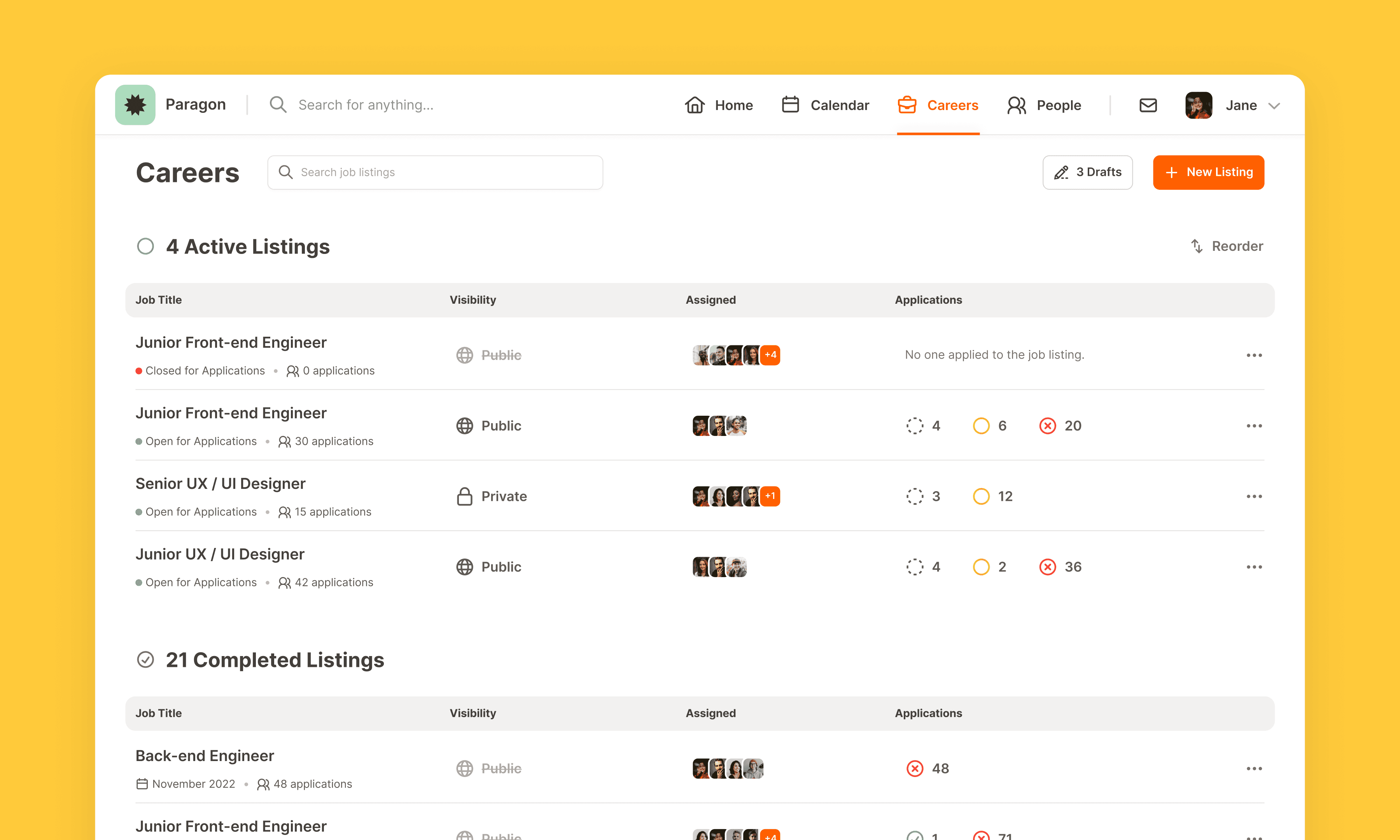
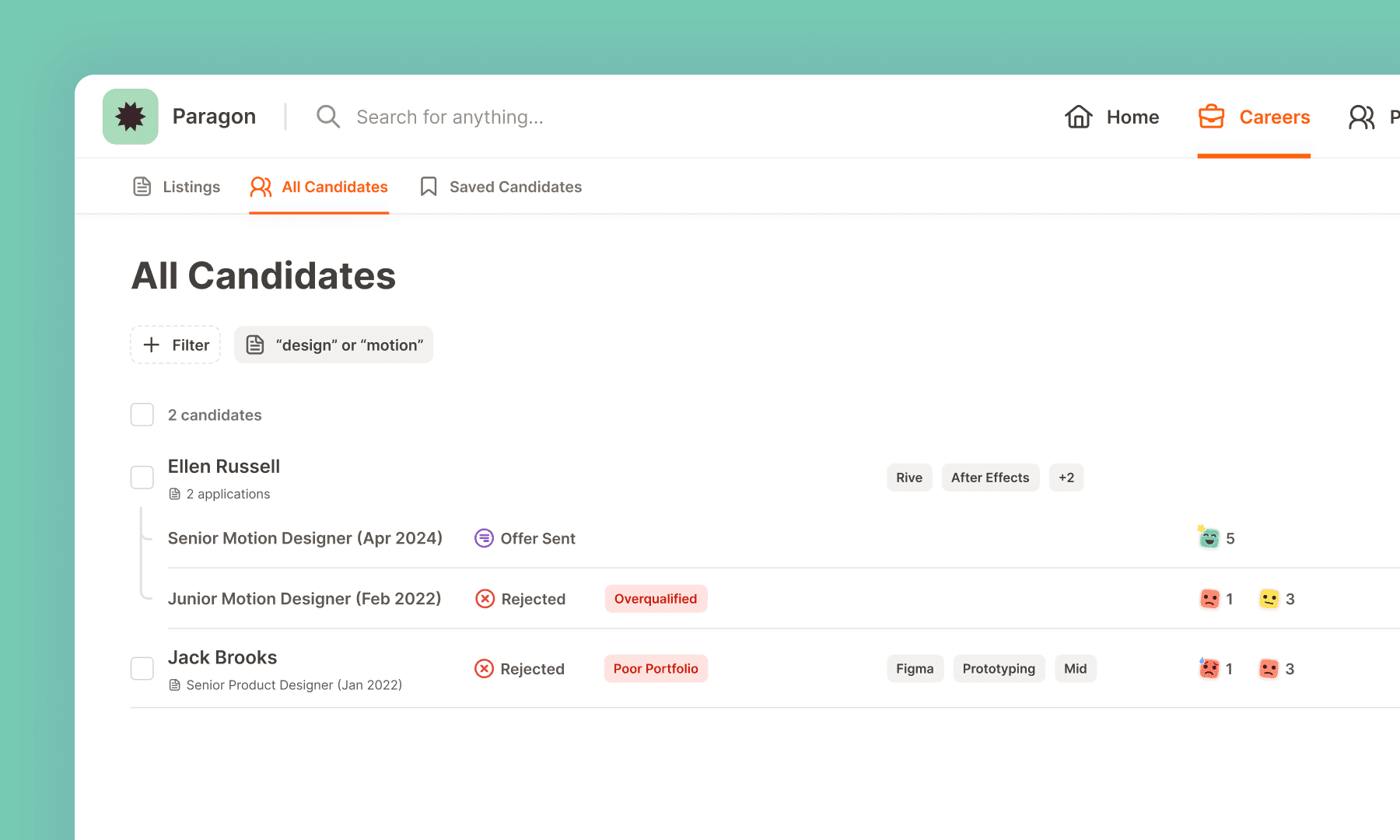
When it comes to overseeing job listings, my goal was to create a main page design that offers clear visibility into all active and completed listings. At any moment, users can effortlessly recognize the status, assigned individuals, and the progress of candidates.
Opening a specific job listing reveals a well-organized view of candidates, categorized by their current stages. This layout presents a view of all the candidates’ scores, labels, number of comments, if they applied multiple times, or rejection reasons. Recognizing the demanding nature of HR managers handling numerous candidates, the design incorporates a practical feature allowing the selection of multiple candidates. Executed through a user-friendly floating menu at the screen's bottom, this tool enables hiring managers to navigate through candidates seamlessly. This proved to be a valuable foundation for future expansions and additional features within the menu.
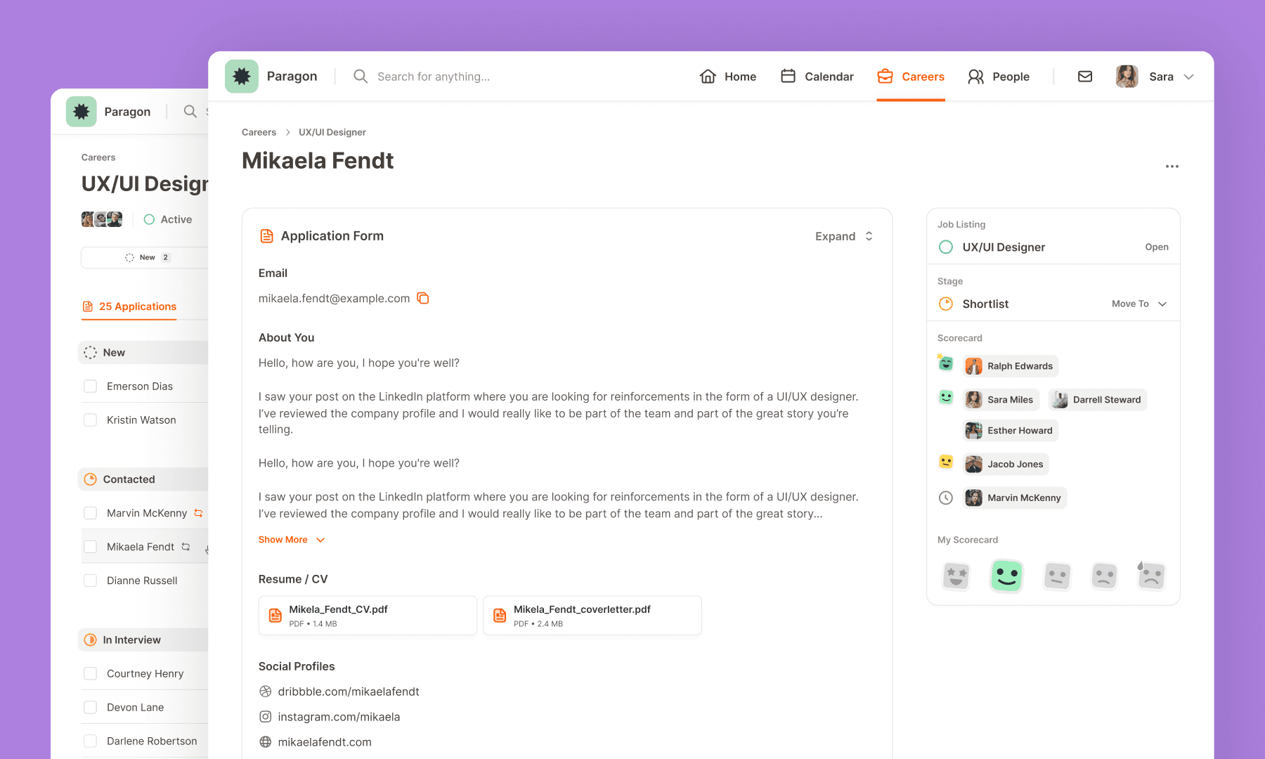
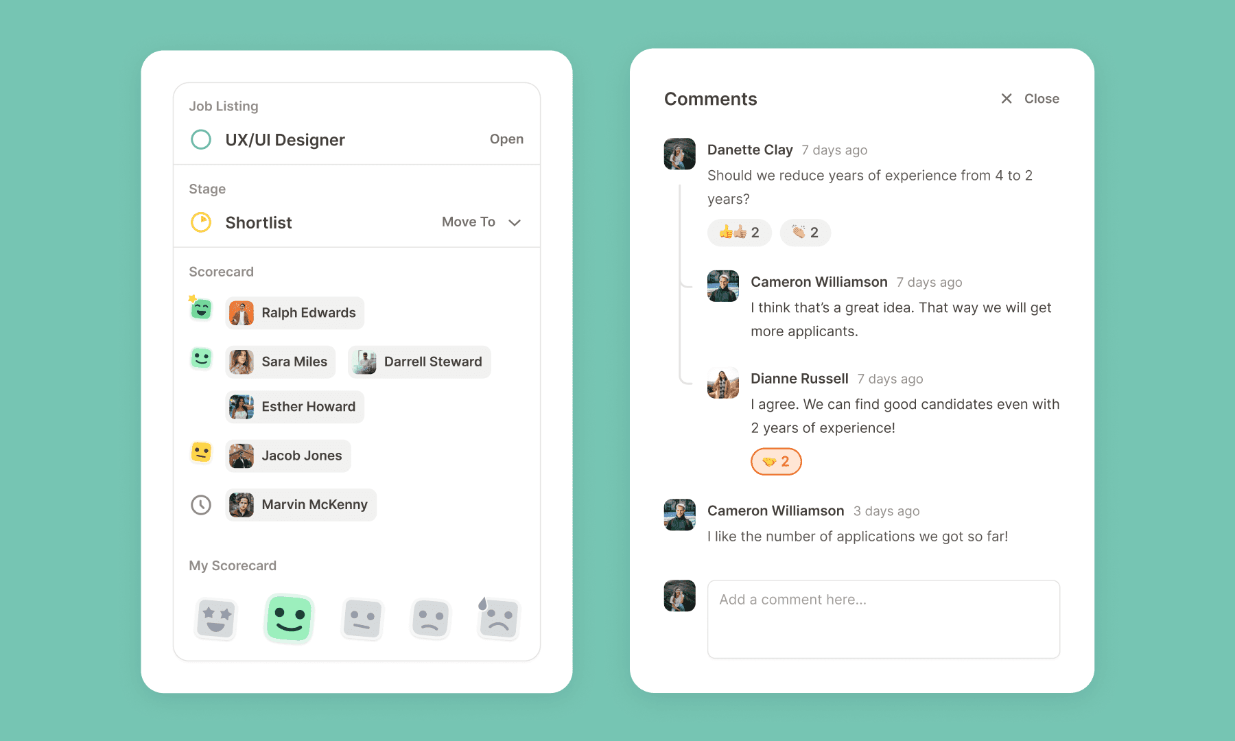
Clicking on an individual candidate provides access to their application form and, on the left, scores from other hiring managers, represented by five scores or "stickers". This user-friendly layout offers an overview, presenting details about the candidate's applied position, which stage they're in, who left a scorecard, pending evaluations, and the user's scorecard. Below this, the Timeline feature unfolds the candidate's journey chronologically, documenting comments, exchanged emails, and stage transitions. Essentially, the entire history of candidate communication is encapsulated within their dedicated Timeline.
Stay connected
Improving communication among hiring managers, as well as between them and candidates, was a core challenge I aimed to tackle. Envisioning PontaHR as the primary communication hub, I sought to consolidate discussions that typically happen across platforms like Slack, Teams, email, etc.
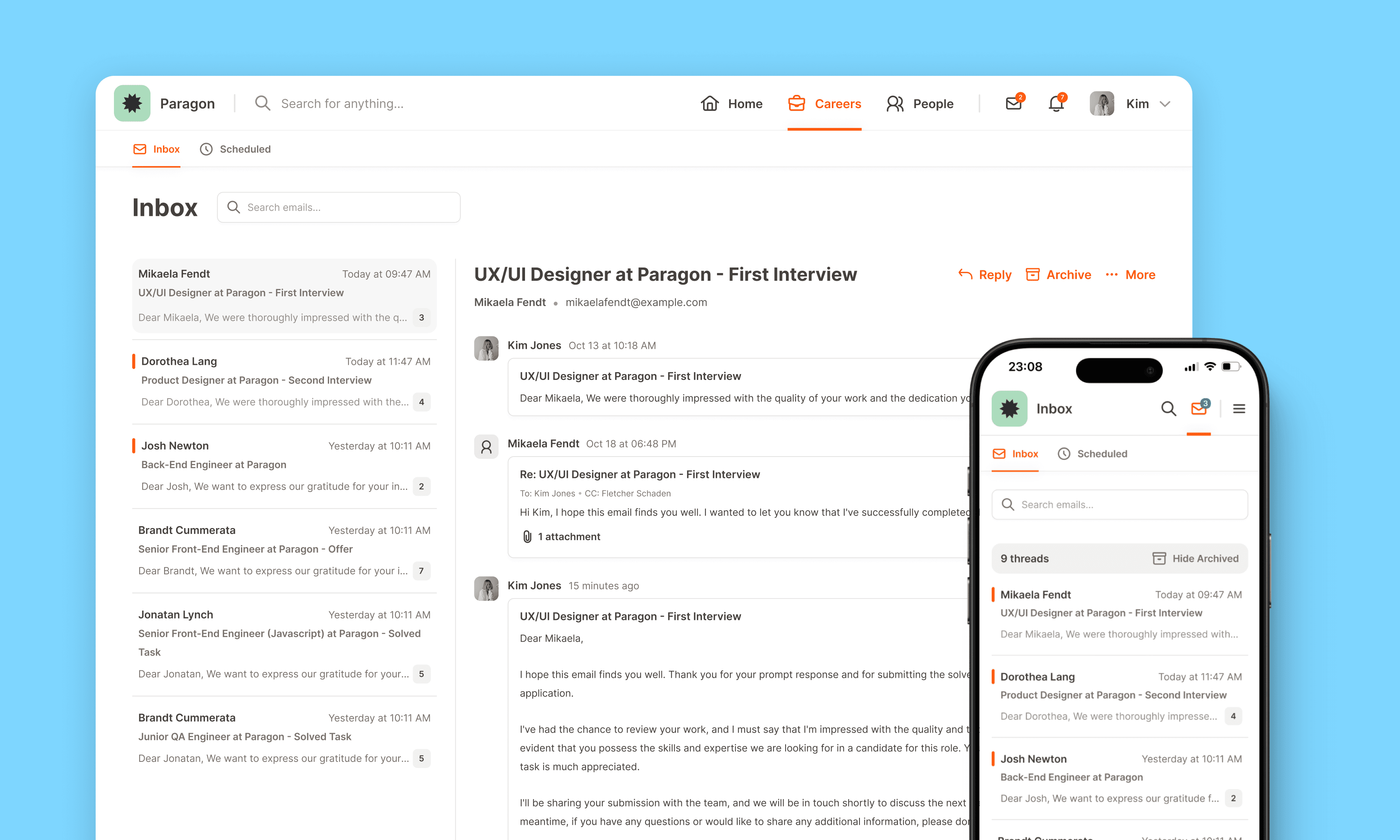
The solution involved integrating comments directly into the candidate's timeline and the job listing itself, ensuring everyone is on the same page when decisions happen. Then, recognizing the importance of candidate communication, I incorporated email functionality directly into the tool. This enables hiring managers to engage in conversations with candidates, a process often restricted to HR members. To maintain privacy, users retain control, choosing when communication should remain solely between the hiring manager and candidate.
Understanding the repetitive nature of hiring manager communications, I introduced an option to create email templates for reuse, particularly beneficial for sending rejection emails. To address the challenge of personalization in mass emails, I implemented variables allowing users to dynamically include candidate names, job listing titles, and company names.
Lastly, to provide a centralized hub for managing incoming and scheduled emails, I created an "Inbox" page. This approach ensures a seamless and organized communication experience for PontaHR users.
Effortless Reporting
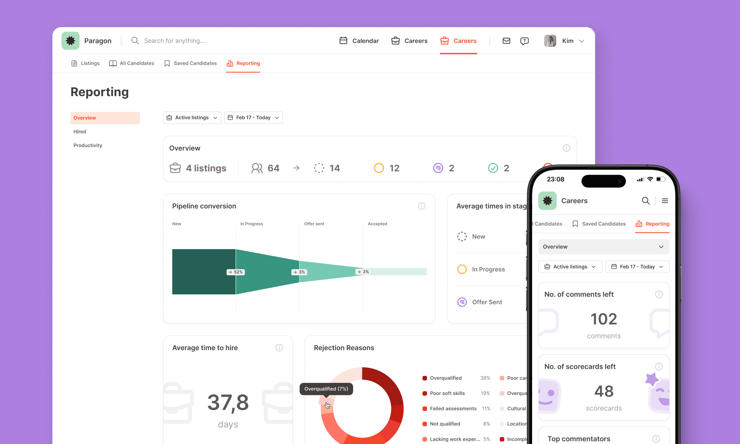
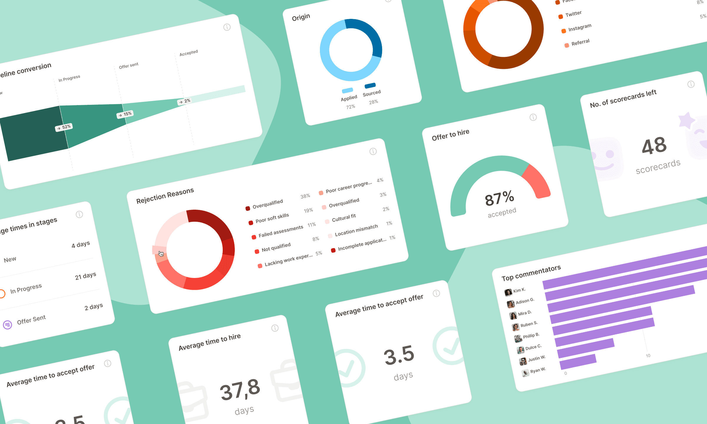
Responding to user requests, I built the Reporting feature for PontaHR, offering HR managers a centralized space to track key statistics. The feature is divided into three distinct sections: Overview, Hired, and Productivity. Each page was designed to provide essential data in a format that is easy to navigate while still engaging.
One of the main challenges was ensuring that a large amount of data could be displayed in a way that didn’t overwhelm users. To solve this, I focused on clean layouts and intuitive visual elements like charts and infographics, making the data easy to interpret at a glance. Another critical aspect was making sure the Reporting feature worked seamlessly on mobile devices, so I had to rethink the design to accommodate smaller screens while keeping the information accessible.
By balancing functionality with visual appeal, the Reporting feature enables HR managers to quickly gain valuable insights, regardless of the device they’re using.
Outcome
Over the past years spent building PontaHR, the entire project has been a profound learning experience. From research, branding, and marketing, to wireframing and crafting a massive design system – it's been a comprehensive journey. Last year, we kicked things off with the ATS, but that's just scratching the surface.
The feedback received has been overwhelmingly positive, with UX/UI design being frequently mentioned as beautiful and intuitive. PontaHR has found its place in the workflows of many companies, where its simple design, coupled with customization options and seamless team collaboration, has proven instrumental in optimizing their hiring processes.
This journey has been an affirmation that a well-crafted tool, rooted in thoughtful design and user experience, can genuinely make a positive impact.
